
We make brands unique
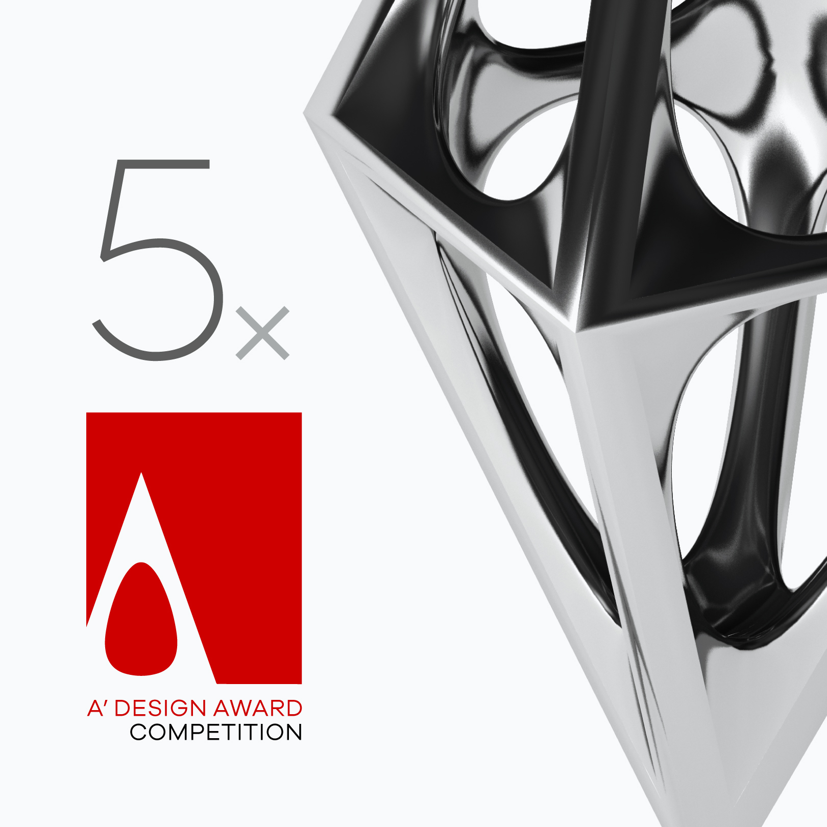
High score at A' Design Awards
This year Rebrandt® has won the international A’ Design Award no less than 5 times with 4 rebrandings and 1 book edition. The winners are the rebranding of the corporate identity for Koopmans, SYNQ, Roger That, The Dutch BACH Consort and the bookdesign for Letizia Battaglia.
The A’ Design Award is one of the world’s largest and most prestigious international design awards. Rebrandt® previously won a Gold A’ Design Award for the rebranding of Woonwaard. The creative team previously won a Red Dot Award and 2x the Rebrand_100 Global Awards.
The A’ Design Award is one of the world’s largest and most prestigious international design awards. Rebrandt® previously won a Gold A’ Design Award for the rebranding of Woonwaard. The creative team previously won a Red Dot Award and 2x the Rebrand_100 Global Awards.
A' DESIGN AWARD — SILVER 2023
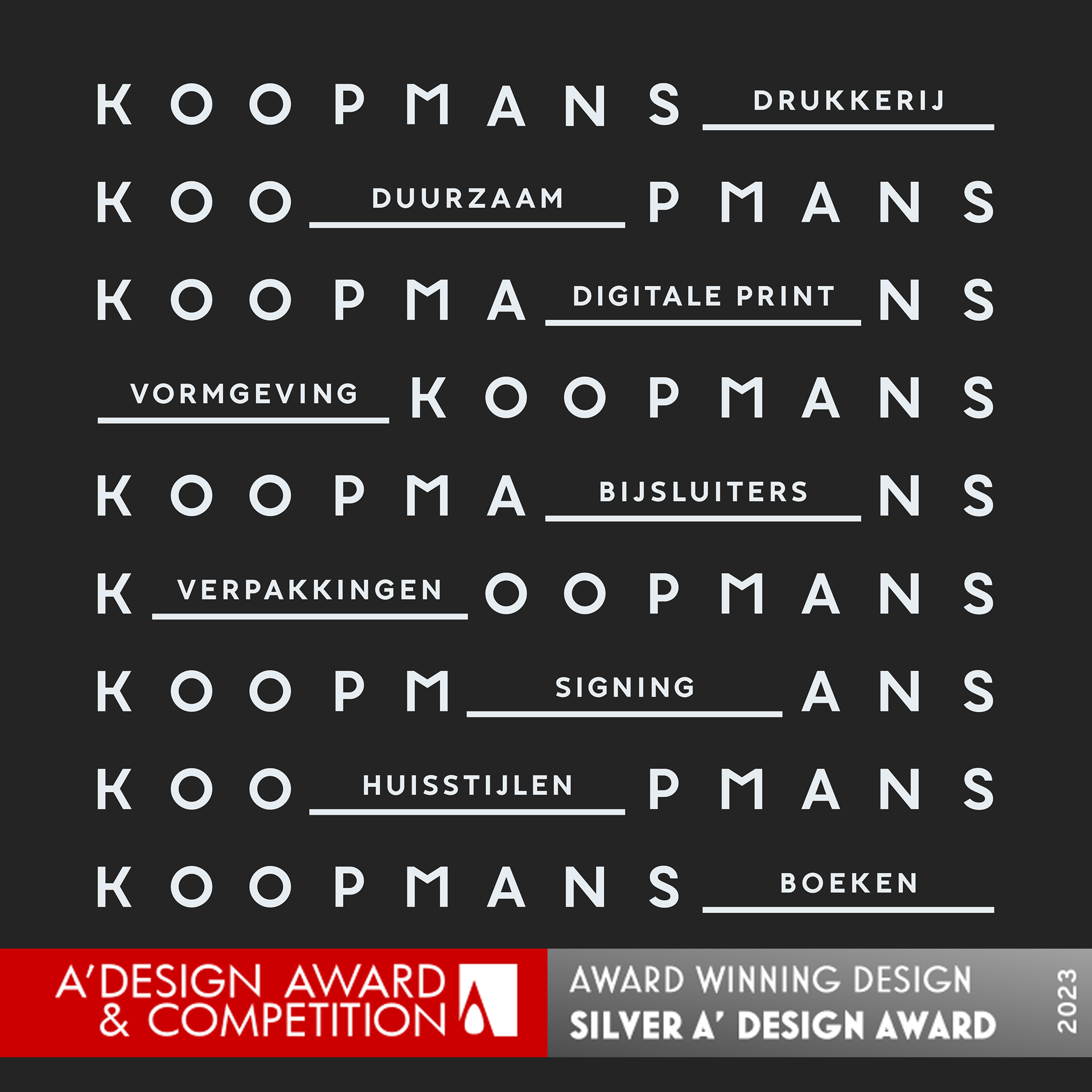
Animated Koopmans Logo
Animated Koopmans Logo
Koopmans asked Rebrandt® to communicate the breadth of the range more clearly. The word ‘print shop’ no longer represents what they do. This new ID is therefore not only an aesthetically appealing design language, but also a strategic marketing instrument that communicates the wide range of products they can offer. Click here for more about this project.
A' DESIGN AWARD — SILVER 2023
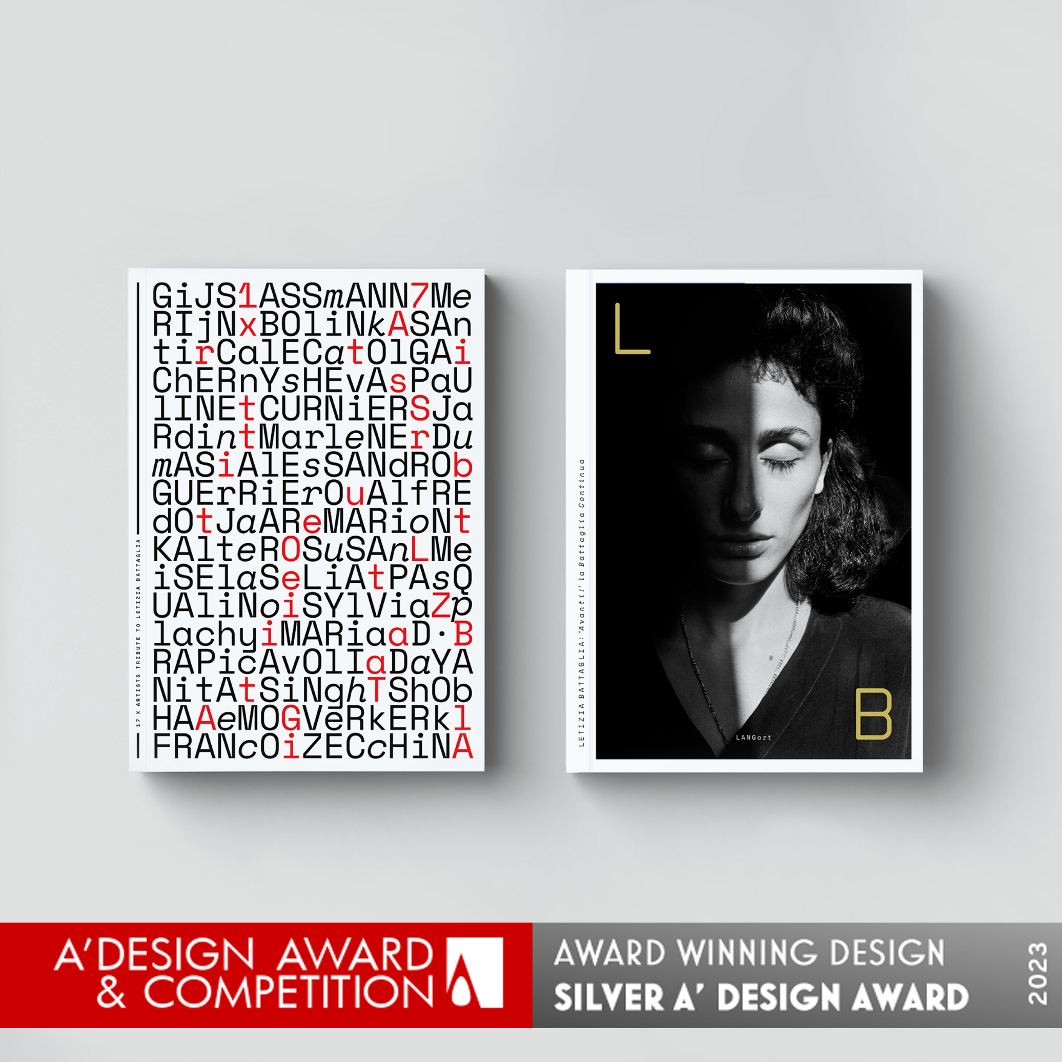
Letizia Battaglia ‘Avanti!’
la Battaglia Continua
Photographer Letizia Battaglia captured a historic timeframe of the Italian history with mafia and misery. This is one of the reasons why Rebrandt® created a design based on ‘archiving’, the strong layout gives the reader the feeling to walk through the time. The book has 2 separated parts; the work of Battaglia and ‘the tribute to’ by 17 artists. Therefore the designer created two frontsides, you just have to turn the book around to step in one or the other entrance. The artists cover is typographically filled with all names of the artists, sepated with letters that construct the titel of “17 x artists tribute to Letizia Battaglia”. Click here for more about this project.Letizia Battaglia ‘Avanti!’
la Battaglia Continua
A' DESIGN AWARD — BRONZE 2023
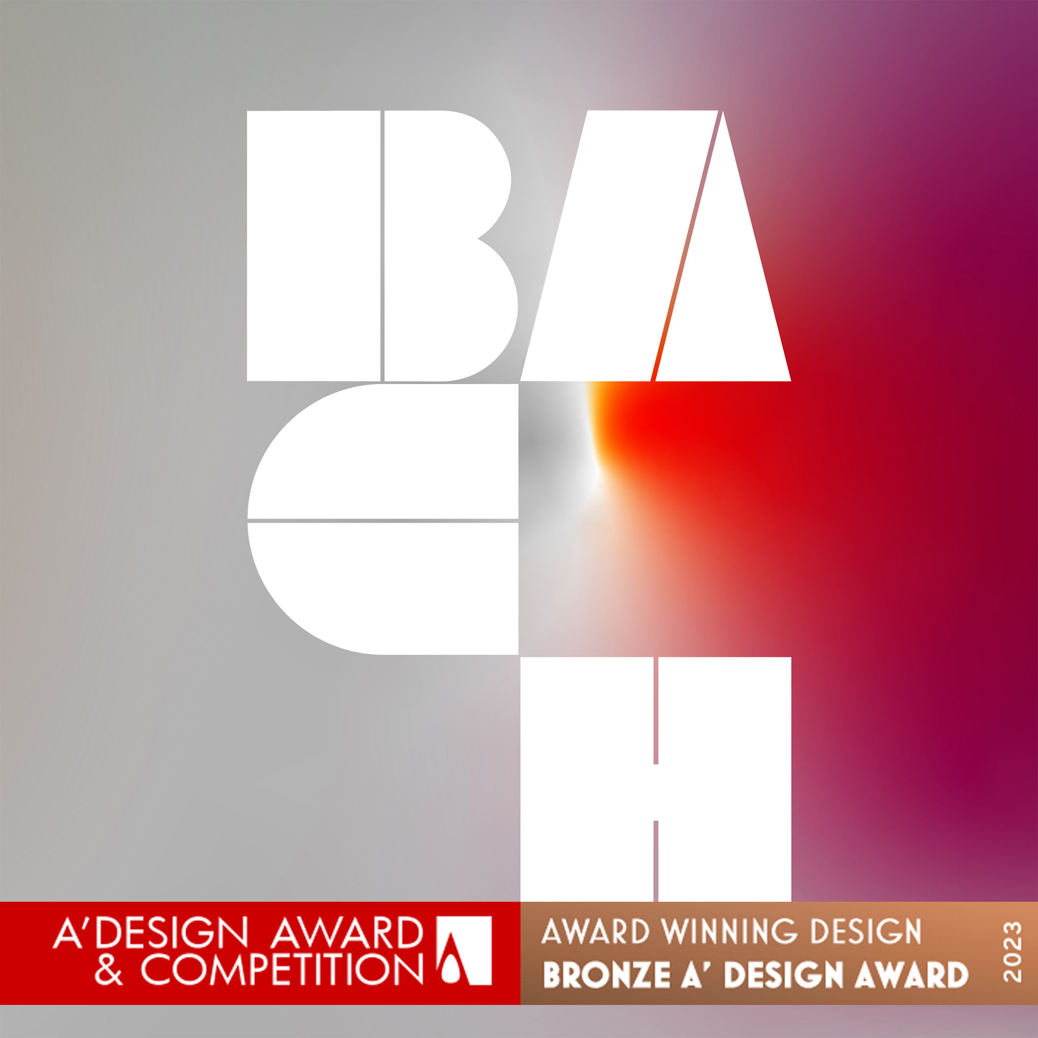
Het Nederlands BACH Consort
The Consort plays BACH in every performance and combines it with modern pieces that are presented for the first time. The designer wanted this mix of classic and modern classic to be represented in the design. The layering of BACH is visibly applied in typography and the color transitions can be adjusted in the future per show series, what makes it suitable for diverse music themes. All elements are build up on a grid of 14, a magic number for Johan Sebastian Bach. Click here for more about this project.Het Nederlands BACH Consort
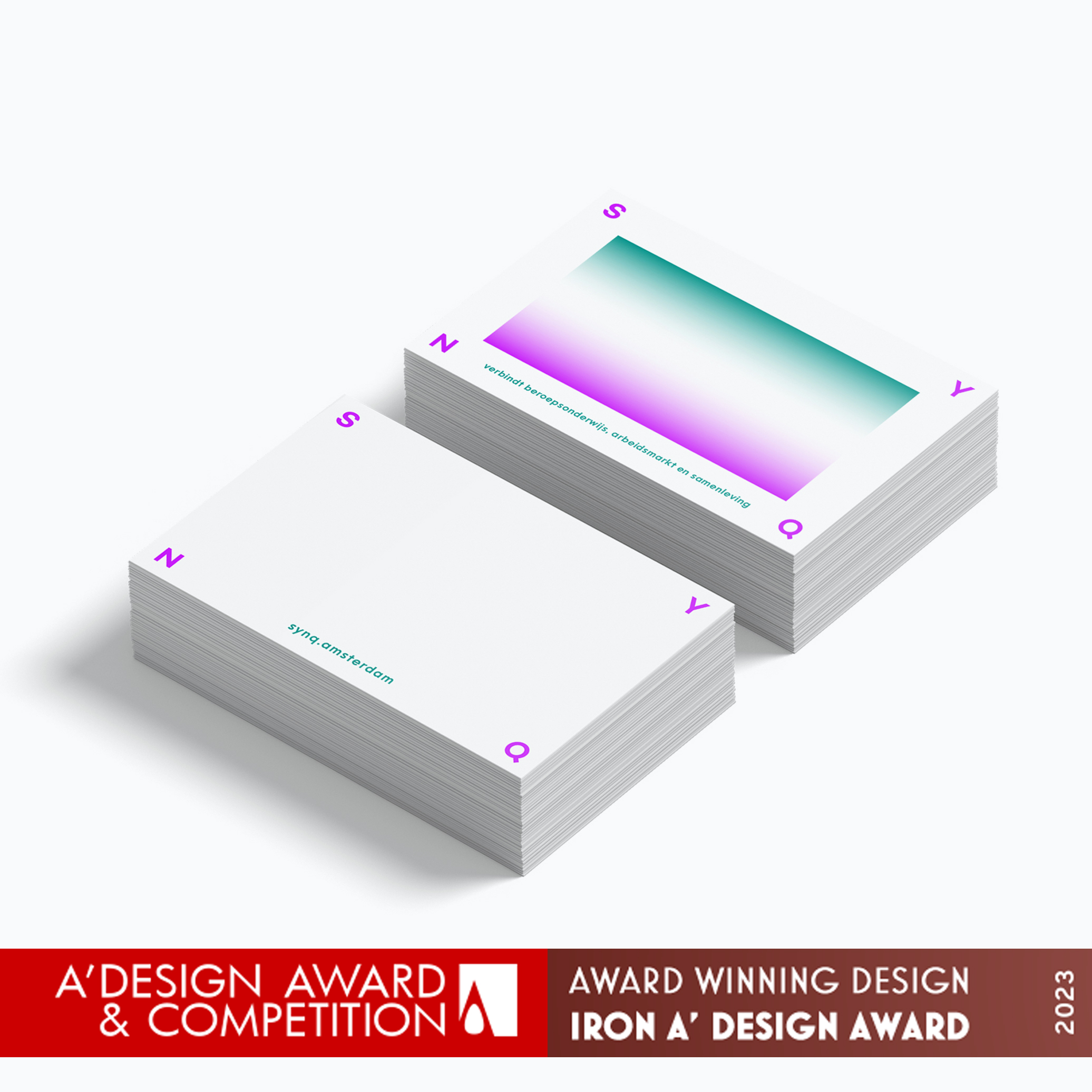
A' DESIGN AWARD — IRON 2023
SYNQ Innovate in Innerspace
The main function of SYNQ is to bring education professionals together, to provide space for innovation and to align this within an environment that is outside the usual working space; the interspace. The S, Y, N and Q are placed as separate elements that together create that space to “SYNQ”. Click here for more about this project.SYNQ Innovate in Innerspace
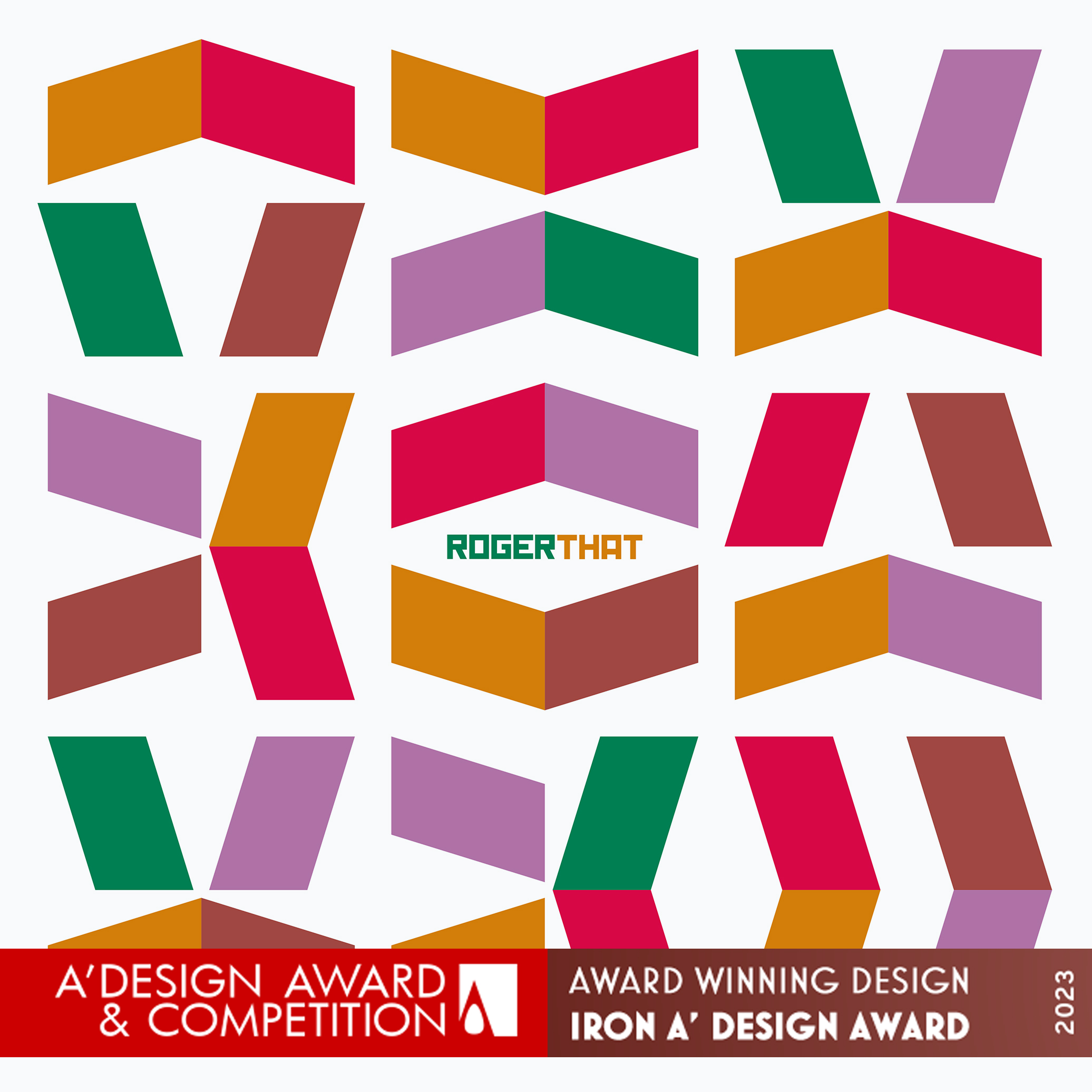
A' DESIGN AWARD — IRON 2023
Roger That Corporate ID
Based on the typical R-logo of designer Rogier van Hulst, Rebrandt® created a block system that represents the multicolouredness and diversity of the youngsters. Which way are you going? What movement is expected? What do you want? The flexibility of the blocks stands for the freedom of moving, a message to all the (young) people; feel free to move to any direction. Click here for more about this project.Roger That Corporate ID

Meet the masters...